 |  Login LoginProducts  SalesSupportDownloadsAbout SalesSupportDownloadsAbout |
| Home » Technical Support » Elevate Web Builder Technical Support » Product Manuals » Elevate Web Builder 3 Manual » Using the IDE » Adding a Component to the Component Library |
 Adding a Component to the Component Library
Use the following steps to add a new component to the component library:
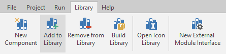
- Click on the Library tab on the main menu.
- Click on the Add to Library button on the Library menu:
- The Add Component dialog will now appear:
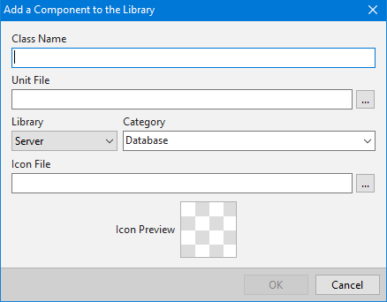
- In this dialog, specify the class name of the component that you wish to add to the component library in the first edit control.
Next, specify the source unit file where the class name is declared. At least one of the declared classes in the interface section of the source unit should match the specified class name. If not, an error will occur when the component library is rebuilt. You can type in the file name directly, or use the browse button (...) to select the source unit using a common Windows file dialog.
Next, select which component library you would like to add the component to.
 If a project is open in the IDE, then the default selected component library will be the component library used by the open project. If a project is not open in the IDE, then the default selected component library will be the last component library used for any operation in the IDE, with the initial component library being the Client component library.
Next, select an existing component library category in which to place the component, or type in a new category in which to place the component using the combo box provided.
Next, select an icon file to use to represent the component in the component library. The default icon file should be a 16 by 16 pixel PNG, JPEG, or GIF image file. You can type in the file name directly, or use the browse button (...) to select the icon file using a common Windows file dialog. After a valid file name has been specified or selected, a preview of the icon file will be shown in the Preview area.
The IDE supports high-DPI screen resolutions, so you can include other variations of the icon file in the same directory as the default icon file using the following file pattern:
<IconFileNameRoot><PixelSize>.<IconFileNameExt>
where <PixelSize> can be:
Pixel Size Screen Resolution 20 A 20 by 20 pixel icon file for 120-DPI screen resolutions 24 A 24 by 24 pixel icon file for 144-DPI screen resolutions 32 A 32 by 32 pixel icon file for 168-DPI or higher screen resolutions
The default 16 by 16 pixel icon file should not include the pixel size as part of the file name. Also, this step is optional, if you don't specify an icon file, or if the specified icon file is invalid, the IDE will use a default, generic icon for the component in the component library. - Click on the OK button.
- If there is a project open in the IDE, then you will see the following dialog appear:
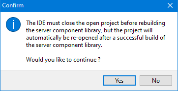
Click on the Yes button to continue with rebuilding the component library.
 More Support Options
This web page was last updated on Tuesday, September 16, 2025 at 04:56 PM | Privacy PolicySite Map © 2026 Elevate Software, Inc. All Rights Reserved Questions or comments ?  E-mail us at info@elevatesoft.com E-mail us at info@elevatesoft.com |
