 |  Login LoginProducts  SalesSupportDownloadsAbout SalesSupportDownloadsAbout |
| Home » Technical Support » Elevate Web Builder Technical Support » Product Manuals » Elevate Web Builder 3 Manual » Using Visual Controls » Layout Management |
 Layout Management
The layout management functionality handles all aspects of the layout of controls, both at design-time and run-time. Layout management is available for all controls in the component library, including the application surface and forms.
Control Layout Properties
Each control in a visual client application possesses several key properties that control the layout of the control:
Left, Top, Width, and Height
The TControl Left, Top, Width, and Height properties specify the defined position and dimensions of the control. These property values serve as the basis for the layout of the control, but can be modified by other layout properties such as the Layout and Constraints properties (see below).
Layout Order
The TControl LayoutOrder property of a control specifies the integer position of the control relative to any and all other child controls within the same container control. The layout order, as its name implies, determines how controls are positioned, relative to one another, by the layout functionality.
Layout
The TControl Layout property of a control is a class instance property that specifies several key aspects of the layout for the control via the following properties:
 Please see the section entitled Layout Rectangle below for more information on the concept of the layout rectangle.
Constraints
The TControl Constraints property of a control specifies any minimum and maximum constraints on the width and height of the control.
Margins
The TControl Margins property of a control specifies any margins for the control.
Padding and Borders
The padding and borders of a control vary depending upon the control class. Some control classes expose one or both of these properties, while others do not. However, these properties do affect the layout of any child controls contained within a container control by reducing the size of the layout rectangle for the container control.
Layout Rectangle
In order to understand how the layout management works, it is important to understand the concept of the layout rectangle. The layout rectangle represents the area of a container control in which the layout of a child control is taking place. The layout rectangle is not a static area: each child control may consume space in the layout rectangle in a specific direction, thus reducing its size, and the layout rectangle can be segmented into different areas via reset points. The layout rectangle is initialized to the client rectangle for the container control. The client rectangle is defined as the bounding rectangle of a container control, minus the width of any borders or padding defined for the container control.
To illustrate the concept of the layout rectangle in its most basic form, let's place a single TBasicPanel control instance on a form (TForm-descendant instance). In this case, the form instance is the container control and the TBasicPanel instance is the child control. Because the form instance does not have any borders or padding defined, the client rectangle, and subsequently, the layout rectangle, is the same size as the form instance's bounding rectangle.
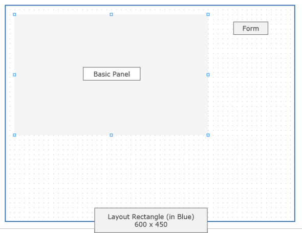
We'll specify that the Layout.Position property of the TBasicPanel should be lpCenter:
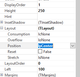
The resulting layout looks like this:
As you can see, the layout functionality used the layout rectangle of the form instance to center the defined dimensions of the TBasicPanel control instance. In this case, the layout rectangle was used for positioning only.
Consuming Space in the Layout Rectangle
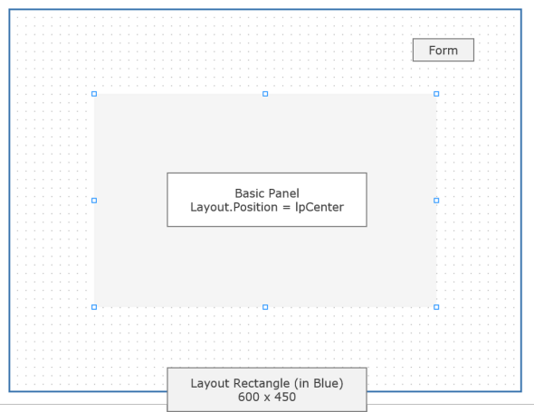
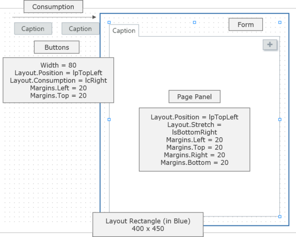
To illustrate how space consumption affects the layout rectangle, let's place two TButton control instances on a form (default width of 80 pixels). Again, the form instance is the container control and the TButton instances are the child controls, and the initial layout rectangle is the same as the client rectangle of the form instance.
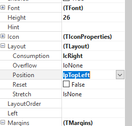
We'll specify that the Layout.Position property of both TButton instances should be lpTopLeft, the Layout.Consumption property should be lcRight, and the Margins.Left and Margins.Top properties should be set to 20 pixels for proper spacing:
The resulting layout looks like this:
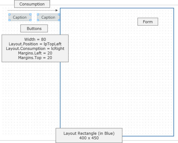
The layout functionality reduced the width of the layout rectangle by the width of each button (80 pixels) combined with the left margin of each button (20 pixels), for a total reduction of 200 pixels.
In most cases a form would not consist of just two buttons, so let's continue with the layout by placing a TPagePanel control instance on the form.
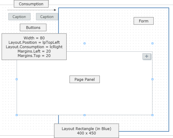
We want the TPagePanel instance to use the rest of the available space on the form below the two TButton instances, so let's specify that the Layout.Position property of the TPagePanel instance should be lpTopLeft, the Layout.Stretch property should be lsBottomRight, and the Margins.Left, Margins.Top, Margins.Right, and Margins.Bottom properties should be set to 20 pixels for proper spacing:
The resulting layout looks like this:
As you can see, this is not exactly what we wanted, and the TPagePanel instance is to the right of the buttons instead of below the buttons.
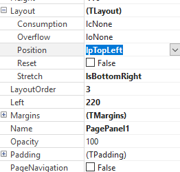
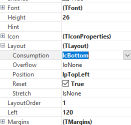
To fix this, we only need to change two properties for the second TButton instance: we need to specify that the Layout.Consumption property should be lcBottom and that the Layout.Reset button should be True:
Changing these two properties in this manner does two things:
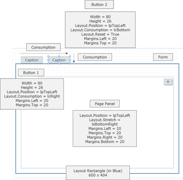
With these changes, the layout functionality reduced the height of the layout rectangle by the height of the second button (34 pixels) combined with the top margin of the second button (20 pixels), for a total reduction of 54 pixels.
You'll also notice that we did not specify the Layout.Consumption property for the TPagePanel instance. This is because consumption only affects the positioning of controls that come after the current control in the layout order. Since the TPagePanel instance is the last control placed on the form, there is no point in specifying the Layout.Consumption property.
Reset Points
Reset points are useful for situations where you have a series of controls consuming space in one direction according to their layout order, but wish to change the consumption direction after the last control in the series. Reset points are set by setting a control's Layout.Reset property to True. As mentioned above, when a reset point is encountered the layout rectangle is set to the layout rectangle of the last reset point. This reset point layout rectangle represents the layout rectangle after any space consumption took place for the control setting the reset point. If there were no prior reset points, then the layout rectangle is set to the client rectangle of the container control.
The following layout shows how you can use multiple reset points to arrange several series of controls without needing to use special container controls:
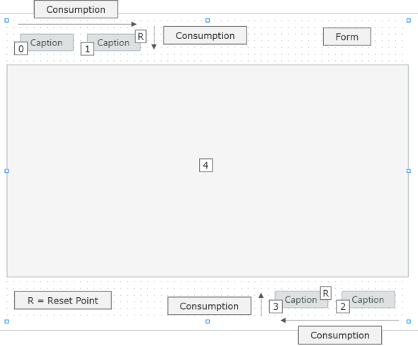
The numbers represent the LayoutOrder property value for the control, and the asterisks (*) represent where a control has its Layout.Reset property set to True. The controls at the top left all have their Layout.Position properties set to lpTopLeft, and the controls at the bottom right all have their Layout.Position properties set to lpBottomRight. The control in the middle has its Layout.Position property set to lpTopLeft, and its Layout.Stretch property to lsBottomRight.
Constraints and Stretching
The defined constraints for a control are always in effect, and any attempts to modify the dimensions of the control in a way that violates these constraints will result in the modification being adjusted so that it adheres to the applicable constraint. This makes constraints very useful when combined with the Layout.Stretch property options.
By default, the TSurface control interface is defined so that the application surface's Layout.Position property is lpTopLeft and the application surface's Layout.Stretch property is lsBottomRight.
This code specifies that any time the application surface vertically overflows the browser viewport, a vertical scrollbar should be shown in the browser. In addition, it sets the minimum size of the application's surface to 40 pixels taller than the main form. Combined with the fact that the surface is set to stretch to fill the entire browser viewport, these two settings enable the following behaviors:
The Layout.Overflow property of a control can be used to create responsive layouts by giving the developer the ability to specify how the current layout rectangle should be adjusted when the dimensions of the control exceed the left, top, right, or bottom bounds of the current layout rectangle. The layout management uses the Overflow property to determine the direction in which the prior (based upon the layout order) control's Consumption property should be temporarily adjusted in order to prevent the current control's dimensions from exceeding the bounds of the current layout rectangle. When an overflow condition occurs, the Reset property for the prior control is temporarily set to True, resetting the current layout rectangle to the layout rectangle of the last reset point, and the Consumption property for the prior control is temporarily modified according to the following rules:
This provides the developer the ability to specify an initial desired layout with positioning, stretching, consumption, margins, constraints, and reset points, while still allowing the layout to adjust within a container control that may dynamically resize while the application is executing.
It is important that you specify an Overflow property that makes sense for a given layout. For example, if the container control is a scrollable control, can be resized horizontally and vertically, but can only scroll vertically, then it would make no sense to specify an Overflow property value of loLeft or loRight. The same logic applies to a scrollable container control that can be resized horizontally and vertically, but can only scroll horizontally. With such a contaner control, it would make no sense to specify an Overflow property value of loTop or loBottom.
Control Layout Properties
Each control in a visual client application possesses several key properties that control the layout of the control:
Left, Top, Width, and Height
The TControl Left, Top, Width, and Height properties specify the defined position and dimensions of the control. These property values serve as the basis for the layout of the control, but can be modified by other layout properties such as the Layout and Constraints properties (see below).
Layout Order
The TControl LayoutOrder property of a control specifies the integer position of the control relative to any and all other child controls within the same container control. The layout order, as its name implies, determines how controls are positioned, relative to one another, by the layout functionality.
Layout
The TControl Layout property of a control is a class instance property that specifies several key aspects of the layout for the control via the following properties:
| Layout Property | Purpose |
| Position | Specifies the type of positioning, if any, to use for the control within the layout rectangle of its container control. |
| Stretch | Specifies a stretch direction, if any, to apply to the control. |
| Consumption | Specifies the direction in which the control consumes space and modifies the layout rectangle for its container control, if at all. |
| Reset | Allows a control to reset the layout rectangle for its container. |
| Overflow | Allows a control to specify the direction in which a layout rectangle should automatically be adjusted when the control's dimensions exceed one of the sides of the layout rectangle. |
Please see the section entitled Layout Rectangle below for more information on the concept of the layout rectangle.Constraints
The TControl Constraints property of a control specifies any minimum and maximum constraints on the width and height of the control.
Margins
The TControl Margins property of a control specifies any margins for the control.
Padding and Borders
The padding and borders of a control vary depending upon the control class. Some control classes expose one or both of these properties, while others do not. However, these properties do affect the layout of any child controls contained within a container control by reducing the size of the layout rectangle for the container control.
Layout Rectangle
In order to understand how the layout management works, it is important to understand the concept of the layout rectangle. The layout rectangle represents the area of a container control in which the layout of a child control is taking place. The layout rectangle is not a static area: each child control may consume space in the layout rectangle in a specific direction, thus reducing its size, and the layout rectangle can be segmented into different areas via reset points. The layout rectangle is initialized to the client rectangle for the container control. The client rectangle is defined as the bounding rectangle of a container control, minus the width of any borders or padding defined for the container control.
To illustrate the concept of the layout rectangle in its most basic form, let's place a single TBasicPanel control instance on a form (TForm-descendant instance). In this case, the form instance is the container control and the TBasicPanel instance is the child control. Because the form instance does not have any borders or padding defined, the client rectangle, and subsequently, the layout rectangle, is the same size as the form instance's bounding rectangle.
We'll specify that the Layout.Position property of the TBasicPanel should be lpCenter:
The resulting layout looks like this:
As you can see, the layout functionality used the layout rectangle of the form instance to center the defined dimensions of the TBasicPanel control instance. In this case, the layout rectangle was used for positioning only.
Consuming Space in the Layout Rectangle
To illustrate how space consumption affects the layout rectangle, let's place two TButton control instances on a form (default width of 80 pixels). Again, the form instance is the container control and the TButton instances are the child controls, and the initial layout rectangle is the same as the client rectangle of the form instance.
We'll specify that the Layout.Position property of both TButton instances should be lpTopLeft, the Layout.Consumption property should be lcRight, and the Margins.Left and Margins.Top properties should be set to 20 pixels for proper spacing:
The resulting layout looks like this:
The layout functionality reduced the width of the layout rectangle by the width of each button (80 pixels) combined with the left margin of each button (20 pixels), for a total reduction of 200 pixels.
In most cases a form would not consist of just two buttons, so let's continue with the layout by placing a TPagePanel control instance on the form.
We want the TPagePanel instance to use the rest of the available space on the form below the two TButton instances, so let's specify that the Layout.Position property of the TPagePanel instance should be lpTopLeft, the Layout.Stretch property should be lsBottomRight, and the Margins.Left, Margins.Top, Margins.Right, and Margins.Bottom properties should be set to 20 pixels for proper spacing:
The resulting layout looks like this:
As you can see, this is not exactly what we wanted, and the TPagePanel instance is to the right of the buttons instead of below the buttons.
To fix this, we only need to change two properties for the second TButton instance: we need to specify that the Layout.Consumption property should be lcBottom and that the Layout.Reset button should be True:
Changing these two properties in this manner does two things:
- It changes the consumption direction towards the bottom of the layout rectangle, which is where we want the TPagePanel instance to be placed.
- It resets the layout rectangle back to the last reset point. Since this is the only control whose Layout.Reset property is set to True, this means that the last reset point is the original layout rectangle for the form. The reset of the layout rectangle will occur before the control consumes any space.
With these changes, the layout functionality reduced the height of the layout rectangle by the height of the second button (34 pixels) combined with the top margin of the second button (20 pixels), for a total reduction of 54 pixels.
You'll also notice that we did not specify the Layout.Consumption property for the TPagePanel instance. This is because consumption only affects the positioning of controls that come after the current control in the layout order. Since the TPagePanel instance is the last control placed on the form, there is no point in specifying the Layout.Consumption property.Reset Points
Reset points are useful for situations where you have a series of controls consuming space in one direction according to their layout order, but wish to change the consumption direction after the last control in the series. Reset points are set by setting a control's Layout.Reset property to True. As mentioned above, when a reset point is encountered the layout rectangle is set to the layout rectangle of the last reset point. This reset point layout rectangle represents the layout rectangle after any space consumption took place for the control setting the reset point. If there were no prior reset points, then the layout rectangle is set to the client rectangle of the container control.
The following layout shows how you can use multiple reset points to arrange several series of controls without needing to use special container controls:
The numbers represent the LayoutOrder property value for the control, and the asterisks (*) represent where a control has its Layout.Reset property set to True. The controls at the top left all have their Layout.Position properties set to lpTopLeft, and the controls at the bottom right all have their Layout.Position properties set to lpBottomRight. The control in the middle has its Layout.Position property set to lpTopLeft, and its Layout.Stretch property to lsBottomRight.
Constraints and Stretching
The defined constraints for a control are always in effect, and any attempts to modify the dimensions of the control in a way that violates these constraints will result in the modification being adjusted so that it adheres to the applicable constraint. This makes constraints very useful when combined with the Layout.Stretch property options.
By default, the TSurface control interface is defined so that the application surface's Layout.Position property is lpTopLeft and the application surface's Layout.Stretch property is lsBottomRight.This code specifies that any time the application surface vertically overflows the browser viewport, a vertical scrollbar should be shown in the browser. In addition, it sets the minimum size of the application's surface to 40 pixels taller than the main form. Combined with the fact that the surface is set to stretch to fill the entire browser viewport, these two settings enable the following behaviors:
- If the browser viewport is larger than the minimum surface height, the application surface will stretch to fill the browser viewport.
- If the browser viewport is smaller than the minimum surface height, the surface will remain the minimum height and the browser viewport will display a vertical scrollbar.
The Layout.Overflow property of a control can be used to create responsive layouts by giving the developer the ability to specify how the current layout rectangle should be adjusted when the dimensions of the control exceed the left, top, right, or bottom bounds of the current layout rectangle. The layout management uses the Overflow property to determine the direction in which the prior (based upon the layout order) control's Consumption property should be temporarily adjusted in order to prevent the current control's dimensions from exceeding the bounds of the current layout rectangle. When an overflow condition occurs, the Reset property for the prior control is temporarily set to True, resetting the current layout rectangle to the layout rectangle of the last reset point, and the Consumption property for the prior control is temporarily modified according to the following rules:
| Overflow | Consumption |
| loTop | lcTop |
| loLeft | lcLeft |
| loRight | lcRight |
| loBottom | lcBottom |
This provides the developer the ability to specify an initial desired layout with positioning, stretching, consumption, margins, constraints, and reset points, while still allowing the layout to adjust within a container control that may dynamically resize while the application is executing.
It is important that you specify an Overflow property that makes sense for a given layout. For example, if the container control is a scrollable control, can be resized horizontally and vertically, but can only scroll vertically, then it would make no sense to specify an Overflow property value of loLeft or loRight. The same logic applies to a scrollable container control that can be resized horizontally and vertically, but can only scroll horizontally. With such a contaner control, it would make no sense to specify an Overflow property value of loTop or loBottom. More Support Options
This web page was last updated on Tuesday, September 16, 2025 at 04:56 PM | Privacy PolicySite Map © 2026 Elevate Software, Inc. All Rights Reserved Questions or comments ?  E-mail us at info@elevatesoft.com E-mail us at info@elevatesoft.com |
