 |  Login LoginProducts  SalesSupportDownloadsAbout SalesSupportDownloadsAbout |
| Home » Technical Support » Elevate Web Builder Technical Support » Product Manuals » Elevate Web Builder 3 Manual » Getting Started » Control Interfaces |
 Control Interfaces
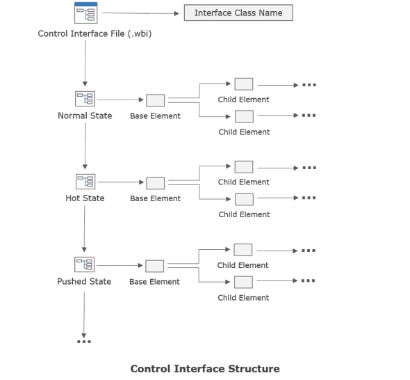
Control interfaces are JSON files that are used to describe the visual appearance of a control. You can create and modify control interfaces using the Control Interface Designer. The structure of a control interface is as follows:
As mentioned in the Application Structure topic, control interfaces are included in a source unit via the $INTERFACE compiler directive and, as mentioned in the Compiling Applications topic, control interfaces are automatically stored in the client application's HTML loader file by the compiler, and are automatically loaded at client application startup by the global TInterfaceManager instance called InterfaceManager in the WebUI unit.
 The name of a control interface file will not necessarily correspond to the control interface class name defined within the file. The standard control interface files shipped with Elevate Web Builder use the same name for both, but this is only a convention and not a requirement. Please see below for more information on control interface class names.
TControl Interface Functionality
As discussed in the Visual Client Applications topic, every TControl descendant class will create one or more TElement class instances to handle the various interface elements in the control. By default, the TControl class automatically creates an element with the name "Base". All element instances should have a unique name within the context of a control class.
There are several standard interface element names defined in the interface section of the WebCtrls unit that should be used with any controls, if possible. For example, controls should normally always call any client element "Client". This isn't a requirement, but it does help keep 3rd party controls standardized.
In addition, every TControl descendant class is always in a particular interface state, represented by the public TControl InterfaceState property. Each TControl can modify its InterfaceState property to affect the layout and display properties of the element instances in the control. By default, the base TControl class automatically handles most interface state changes. The standard interface states, and how they are triggered, are detailed below:
There are several other control-specific states that are used by the standard component library component classes. A control developer is free to use any interface state name that they wish, but the standard interface states should not be used for purposes other than their intended use.
How Control Interfaces are Applied to a Control
Internally, control interfaces are applied to the interface elements of controls using the TInterfaceManager ApplyInterface method. This method uses several key pieces of information to determine how to apply an interface to a control and the interface elements that it owns:
The control interface class name is provided by the TControl GetInterfaceClassName method:
This method can be used to return any string that represents the control interface class name that the control wants to apply when the interface state changes. Normally, the value returned here is simply the class name for the control. For example, the TEdit control GetInterfaceClassName method implementation looks like this:
You are not forced to use the control's class name as the interface class name. Sometimes it might be necessary to use the control's class name combined with other string values to create a dynamic interface class name. For example, the TScrollBar class uses the orientation of the scroll bar to compute a dynamic interface class name:
Once the control interface class name is found by the interface manager, the control interface states are searched for the value assigned to the InterfaceState property. If a matching state is found in the control interface, then the properties of the various elements in the control interface state are applied to the element instances contained within the control class instance whose interface state is being changed. This property application process is also done by matching the names of the elements in the control interface to the names of the element instances in the control class instance.
If an interface state is specified that does not exist, then nothing occurs and the visual appearance of the control will not change. If one or more element names in the control interface state do not match the names of the element instances created by the control class instance, then the properties of those elements will not be applied.
If an interface state is being assigned to a control class instance for the first time (InterfaceState property is blank), then the interface manager will simply assign all properties of the control interface elements to the matching element instances contained within the control class instance. If an interface state has already been assigned to the control class instance, then the interface manager will only apply the properties specified via the control interface element's ApplyProperties property. The ApplyProperties property of a control interface element is a set of Boolean values that mirror the control interface element properties. If a property is set to True in the ApplyProperties property, then it will be assigned to the element instance when the interface state is applied.
If you specify that a property should be applied in any state, then you should also specify that the property should be applied in all other states in the control interface. Failure to do this will result in certain properties becoming "sticky" and not reverting to a known state as the interface state of the control changes. For example, suppose that you have created a TBorderButton control that you want to show a different color border when the mouse hovers over the control and the interface state changes to "Hot". In such a case, you'll need to be sure that the ApplyProperties.Border property is set to True for the Base element defined in all states in the control interface, including the standard Normal state.
Customizing Control Interfaces
Elevate Web Builder ships with two complete sets of standard control interfaces located in the \interfaces subdirectory under the main installation directory:
Because the compiler uses the standard project and component library search paths to find both source units and control interfaces, you can make copies of the standard control interfaces, place them in a new directory, and then modify the project's compiler search paths so that the new directory is included. Please see the Modifying Project Options topic for more information on modifying the project's compiler search paths. After that point, any modifications to the control interfaces in this new directory will be used instead of the standard control interfaces. Please see the Opening a Control Interface topic for more information on how to open and modify existing control interfaces using the control interface designer.
By default, the Automatically load custom control interfaces in project search paths option in the Settings dialog is enabled. This means that the IDE will automatically load any custom control interface files located in the project's compiler search paths whenever a visual client project is opened in the IDE. When checking to see if a control interface has been customized, the IDE compares the path of the default control interface file in the component library (based upon the Search Paths setting on the Component Library page) with the path of any control interfaces with the same file name present in the project's compiler search paths. If a match is found, then the control interface file found in the project's compiler search paths is loaded into the IDE and used with the project's form designers. After the project is closed, the default control interfaces are reloaded.
The Music Collection, Photo Album, and Contact Form example applications use customized control interfaces to offer unique interfaces for each application. You can open these example applications in the IDE to see what effect customized control interfaces have upon the look and feel of the applications.
As mentioned in the Application Structure topic, control interfaces are included in a source unit via the $INTERFACE compiler directive and, as mentioned in the Compiling Applications topic, control interfaces are automatically stored in the client application's HTML loader file by the compiler, and are automatically loaded at client application startup by the global TInterfaceManager instance called InterfaceManager in the WebUI unit.
The name of a control interface file will not necessarily correspond to the control interface class name defined within the file. The standard control interface files shipped with Elevate Web Builder use the same name for both, but this is only a convention and not a requirement. Please see below for more information on control interface class names.TControl Interface Functionality
As discussed in the Visual Client Applications topic, every TControl descendant class will create one or more TElement class instances to handle the various interface elements in the control. By default, the TControl class automatically creates an element with the name "Base". All element instances should have a unique name within the context of a control class.
There are several standard interface element names defined in the interface section of the WebCtrls unit that should be used with any controls, if possible. For example, controls should normally always call any client element "Client". This isn't a requirement, but it does help keep 3rd party controls standardized.In addition, every TControl descendant class is always in a particular interface state, represented by the public TControl InterfaceState property. Each TControl can modify its InterfaceState property to affect the layout and display properties of the element instances in the control. By default, the base TControl class automatically handles most interface state changes. The standard interface states, and how they are triggered, are detailed below:
| Interface State | Trigger Condition |
| Normal | This is the default state for controls, and is triggered during control initialization. |
| Disabled | Triggered when the TControl Disabled property is set to True. |
| Hot | Triggered when the mouse is moved over the bounds of the control. |
| Focused | Triggered when the control obtains focus. |
| Pushed | Triggered when the left mouse button is pressed within the bounds of the control. |
| Minimized | Triggered when the control (normally a container control) is minimized. |
| ReadOnly | Triggered when the TBindableControl ReadOnly property (protected) is set to True. |
| Error | Triggered when the TBindableControl Error property (protected) is set to True. |
There are several other control-specific states that are used by the standard component library component classes. A control developer is free to use any interface state name that they wish, but the standard interface states should not be used for purposes other than their intended use.
How Control Interfaces are Applied to a Control
Internally, control interfaces are applied to the interface elements of controls using the TInterfaceManager ApplyInterface method. This method uses several key pieces of information to determine how to apply an interface to a control and the interface elements that it owns:
- The interface class name
- A specified interface state
- The interface element names
The control interface class name is provided by the TControl GetInterfaceClassName method:
function GetInterfaceClassName: String; virtual;
This method can be used to return any string that represents the control interface class name that the control wants to apply when the interface state changes. Normally, the value returned here is simply the class name for the control. For example, the TEdit control GetInterfaceClassName method implementation looks like this:
function TEdit.GetInterfaceClassName: String;
begin
   Result:=TEdit.ClassName;
end;
You are not forced to use the control's class name as the interface class name. Sometimes it might be necessary to use the control's class name combined with other string values to create a dynamic interface class name. For example, the TScrollBar class uses the orientation of the scroll bar to compute a dynamic interface class name:
function TScrollBar.GetInterfaceClassName: String;
begin
   case FOrientation of
      soVertical:
         Result:=TScrollBar.ClassName+VERTICAL_CLASS_NAME;
      soHorizontal:
         Result:=TScrollBar.ClassName+HORIZONTAL_CLASS_NAME;
      else
         Result:='';
      end;
end;
Once the control interface class name is found by the interface manager, the control interface states are searched for the value assigned to the InterfaceState property. If a matching state is found in the control interface, then the properties of the various elements in the control interface state are applied to the element instances contained within the control class instance whose interface state is being changed. This property application process is also done by matching the names of the elements in the control interface to the names of the element instances in the control class instance.
If an interface state is specified that does not exist, then nothing occurs and the visual appearance of the control will not change. If one or more element names in the control interface state do not match the names of the element instances created by the control class instance, then the properties of those elements will not be applied.If an interface state is being assigned to a control class instance for the first time (InterfaceState property is blank), then the interface manager will simply assign all properties of the control interface elements to the matching element instances contained within the control class instance. If an interface state has already been assigned to the control class instance, then the interface manager will only apply the properties specified via the control interface element's ApplyProperties property. The ApplyProperties property of a control interface element is a set of Boolean values that mirror the control interface element properties. If a property is set to True in the ApplyProperties property, then it will be assigned to the element instance when the interface state is applied.
If you specify that a property should be applied in any state, then you should also specify that the property should be applied in all other states in the control interface. Failure to do this will result in certain properties becoming "sticky" and not reverting to a known state as the interface state of the control changes. For example, suppose that you have created a TBorderButton control that you want to show a different color border when the mouse hovers over the control and the interface state changes to "Hot". In such a case, you'll need to be sure that the ApplyProperties.Border property is set to True for the Base element defined in all states in the control interface, including the standard Normal state.Customizing Control Interfaces
Elevate Web Builder ships with two complete sets of standard control interfaces located in the \interfaces subdirectory under the main installation directory:
| Control Interface Set | Description |
| Default | This is the default set of control interfaces and is intended to offer a Windows "Metro" look similar to Windows 8 and higher. It uses the Seqoe UI font and font sizes that are big enough for most touch environments. |
| Desktop | This is a set of control interfaces intended to be used primarily for desktop applications. It also uses the Segoe UI font, but with smaller font sizes and narrower borders. |
Because the compiler uses the standard project and component library search paths to find both source units and control interfaces, you can make copies of the standard control interfaces, place them in a new directory, and then modify the project's compiler search paths so that the new directory is included. Please see the Modifying Project Options topic for more information on modifying the project's compiler search paths. After that point, any modifications to the control interfaces in this new directory will be used instead of the standard control interfaces. Please see the Opening a Control Interface topic for more information on how to open and modify existing control interfaces using the control interface designer.
By default, the Automatically load custom control interfaces in project search paths option in the Settings dialog is enabled. This means that the IDE will automatically load any custom control interface files located in the project's compiler search paths whenever a visual client project is opened in the IDE. When checking to see if a control interface has been customized, the IDE compares the path of the default control interface file in the component library (based upon the Search Paths setting on the Component Library page) with the path of any control interfaces with the same file name present in the project's compiler search paths. If a match is found, then the control interface file found in the project's compiler search paths is loaded into the IDE and used with the project's form designers. After the project is closed, the default control interfaces are reloaded.
The Music Collection, Photo Album, and Contact Form example applications use customized control interfaces to offer unique interfaces for each application. You can open these example applications in the IDE to see what effect customized control interfaces have upon the look and feel of the applications. More Support Options
This web page was last updated on Tuesday, September 16, 2025 at 04:56 PM | Privacy PolicySite Map © 2026 Elevate Software, Inc. All Rights Reserved Questions or comments ?  E-mail us at info@elevatesoft.com E-mail us at info@elevatesoft.com |
