 |  Login LoginProducts  SalesSupportDownloadsAbout SalesSupportDownloadsAbout |
| Home » Technical Support » Elevate Web Builder Technical Support » Product Manuals » Elevate Web Builder 3 Manual » Using the IDE » Using the Control Interface Designer |
 Using the Control Interface Designer
The control interface designer is used for creating new control interfaces or editing existing control interfaces. It has the following layout:
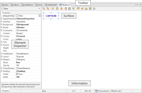
The unit of measure used by the designer surface is the pixel, and the resolution is always assumed to be 96 pixels per inch. All modern web browsers use a virtual resolution of 96 pixels per inch, regardless of the actual resolution on the client machine's display. The web browser automatically handles the translation between the virtual resolution and the display resolution of the client machine.
By default, the designer surface shows a grid to aid with element placement and alignment, and the grid guides (dots) are spaced apart at 10 pixel intervals. Please see the Modifying IDE Settings topic for more information on modifying the designer surface grid properties.
 Any time you hover the mouse over any element on the designer surface, tooltip information will be displayed about the element, including the name and position/size.
If you haven't already, please make sure to read the Control Interfaces topic before proceeding. It explains the structure of control interface and many of the control interface concepts that are used in the control interface designer.
When a control interface designer is active in the IDE, the control interface navigator is accessible via the Tools window in the IDE:
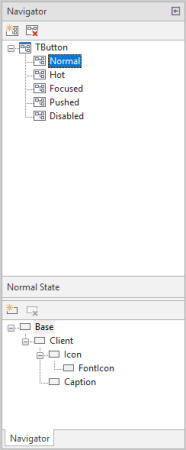
The control interface navigator allows you to specify the control interface class name, add/rename/delete control interface states, and add/rename/delete interface elements for a given control interface state.
Specifying the Interface Class Name
By default, a control interface is assigned the base TControl control class name. You can change the control interface class name by selecting the root control interface class name node in the control interface navigator and pressing the F2 key. You can then set the control interface class name to the desired name.
The interface class name normally corresponds to an existing control class name, but does not always do so. However, as discussed in the Control Interfaces topic, the specified interface class name should correspond to a value returned by the protected TControl GetInterfaceClassName method for one or more controls in the component library.
If the interface class name does not correspond to any interface class names used by any controls in the component library, then the interface will effectively be ignored by the component library.
Adding a New Interface State
Control interfaces consist of one or more interface states. The default state is, by convention, named "Normal", and the first interface state that is created will automatically be named "Normal".
Use the following steps to add a new interface state to the control interface:
Use the following steps to rename an existing interface state in the control interface:
Use the following steps to remove an existing interface state from the control interface:
You can use drag and drop operations with the mouse to move an interface state to a different position in the list of defined interface states in the control interface navigator. Simply click on the desired interface state with the left mouse button, hold the left mouse button down, and drag the interface state to the desired new position.
Adding a New Element to an Interface State
Control interface states consist of one or more interface elements. The default element is, by convention, named "Base" and defined as the base container element for the interface state.
Use the following steps to add a new element to an interface state:
Use the following steps to rename an existing element in an interface state:
Use the following steps to remove an existing element in an interface state:
To select a single element in the control interface navigator or control interface designer surface, click on the desired element with the left mouse button. To select more than one element, hold down the Shift key while clicking on the desired elements with the left mouse button. Selecting multiple elements is desirable when one wants to resize or align multiple elements at the same time to ensure that their placement or size is uniform, or when one wants to copy and paste a group of elements.
You can only select multiple elements within the same parent element.
You can also use the mouse to directly select a group of elements using a lasso:
Once an element has been placed on the designer surface, you will see that the element will have designer handles on all four sides and corners of the element:
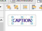
These designer handles can be used to change the origin and size of an element. To accomplish this, click on a designer handle with the left mouse button, hold the left mouse button down, and drag the designer handle in the desired direction. You can also use the keyboard to resize a component by holding down the Shift key while using the Up, Down, Right, and Left arrow keys to resize the component on a pixel-by-pixel basis.
Certain elements may have constraints on how tall/wide they can be. In such cases, attempts to resize the element will result in the element size not exceeding the specified constraints. Also, you cannot use the left mouse button to resize elements when multiple elements are selected. In such cases, you can only use the keyboard to do so.
Moving an Element
To move an element, click on the element with the left mouse button, hold the mouse button down, and drag the element to the desired location. You can also use the keyboard to move an element by holding down the Ctrl key while using the up, down, right, and left arrow keys to move the element on a pixel-by-pixel basis. Both of these techniques also work when multiple elements are selected.
Element Layout and Alignment
The layout toolbar for the designer can be used to adjust the alignment and layering (send to back/bring to front) of elements:

Each layout toolbar button has tooltip help that explains the purpose of the button.
Element Inspector
The element inspector is located on the left-hand side of the control interface designer, and allows you to modify the properties of the currently-selected element in the control interface designer. It consists of an element selection combo box and a list of the properties of an element:
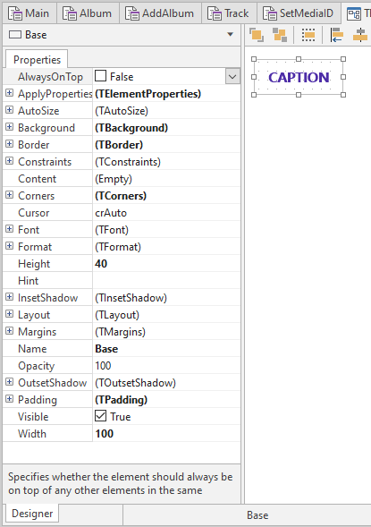
To modify any property of an element, click on the desired property value, and type in the new value. If applicable, the property may have a special property editor in the form of a drop-down list or dialog that is accessible using a button to the right of the property value. Double-clicking on the property value will also automatically launch the applicable property editor.
You can get context-sensitive help on any property in the element inspector by clicking on the desired property and pressing the F1 key. For more information on using the help browser, please see the Accessing Help topic.
 Undo functionality is currently not available for the control interface designer, so any modifications or deletions of elements cannot be undone. Please be careful when deleting elements to ensure that one does not lose a lot of hard work. If you do accidentally delete an element, you can fix the issue by simply closing the interface without saving the modifications, and then re-opening the interface. However, this depends upon how much other work has been done to the interface since the last save point, so it is wise to save your modifications on a regular basis.
The unit of measure used by the designer surface is the pixel, and the resolution is always assumed to be 96 pixels per inch. All modern web browsers use a virtual resolution of 96 pixels per inch, regardless of the actual resolution on the client machine's display. The web browser automatically handles the translation between the virtual resolution and the display resolution of the client machine.
By default, the designer surface shows a grid to aid with element placement and alignment, and the grid guides (dots) are spaced apart at 10 pixel intervals. Please see the Modifying IDE Settings topic for more information on modifying the designer surface grid properties.
Any time you hover the mouse over any element on the designer surface, tooltip information will be displayed about the element, including the name and position/size.If you haven't already, please make sure to read the Control Interfaces topic before proceeding. It explains the structure of control interface and many of the control interface concepts that are used in the control interface designer.
When a control interface designer is active in the IDE, the control interface navigator is accessible via the Tools window in the IDE:
The control interface navigator allows you to specify the control interface class name, add/rename/delete control interface states, and add/rename/delete interface elements for a given control interface state.
Specifying the Interface Class Name
By default, a control interface is assigned the base TControl control class name. You can change the control interface class name by selecting the root control interface class name node in the control interface navigator and pressing the F2 key. You can then set the control interface class name to the desired name.
The interface class name normally corresponds to an existing control class name, but does not always do so. However, as discussed in the Control Interfaces topic, the specified interface class name should correspond to a value returned by the protected TControl GetInterfaceClassName method for one or more controls in the component library.
If the interface class name does not correspond to any interface class names used by any controls in the component library, then the interface will effectively be ignored by the component library.Adding a New Interface State
Control interfaces consist of one or more interface states. The default state is, by convention, named "Normal", and the first interface state that is created will automatically be named "Normal".
Use the following steps to add a new interface state to the control interface:
- Click on the Add State toolbar button:

- If the control interface class name node is selected when the Add State toolbar button is clicked, then the new interface state will only contain one base element and will be effectively empty. If a control interface state node is selected when the Add State toolbar button is clicked, then the new interface state will be a copy of the currently-selected control interface state. This makes it easy to create copies of existing states and then make minor modifications to reflect the state changes.
Use the following steps to rename an existing interface state in the control interface:
- Click on the desired state in the list of interface states in the control interface navigator.
- Press the F2 key to start the rename, and then type in the new name of the interface state. Press the Enter key to complete the renaming.
Use the following steps to remove an existing interface state from the control interface:
- Click on the Remove State toolbar button:

- A dialog similar to the following will now appear:
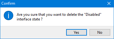
The name of the specifed interface state will reflect the interface state being removed. Click Yes to remove the selected interface state, or No to cancel the removal of the interface state.
You can use drag and drop operations with the mouse to move an interface state to a different position in the list of defined interface states in the control interface navigator. Simply click on the desired interface state with the left mouse button, hold the left mouse button down, and drag the interface state to the desired new position.
Adding a New Element to an Interface State
Control interface states consist of one or more interface elements. The default element is, by convention, named "Base" and defined as the base container element for the interface state.
Use the following steps to add a new element to an interface state:
- Click on the Add Element toolbar button in the control interface navigator:

- The new element will be added as a child element of the currently-selected element in the control interface navigator.
Use the following steps to rename an existing element in an interface state:
- Click on the desired element in the list of elements for the interface state in the control interface navigator.
- Press the F2 key to start the rename, and then type in the new name of the element. Press the Enter key to complete the renaming.
Use the following steps to remove an existing element in an interface state:
- Click on the Remove Element toolbar button:

- The interface state element will then be removed.
To select a single element in the control interface navigator or control interface designer surface, click on the desired element with the left mouse button. To select more than one element, hold down the Shift key while clicking on the desired elements with the left mouse button. Selecting multiple elements is desirable when one wants to resize or align multiple elements at the same time to ensure that their placement or size is uniform, or when one wants to copy and paste a group of elements.
You can only select multiple elements within the same parent element.You can also use the mouse to directly select a group of elements using a lasso:
- If the group of elements are placed on the base element itself, then you can click and hold down the left mouse button to begin the selection. Then, while keeping the left mouse button down, move the mouse to lasso the desired element(s).
- If the group of elements are placed on a child element, then you can click and hold down the left mouse button, while also pressing the Ctrl key, to begin the selection. Then, while keeping the left mouse button and Ctrl key down, move the mouse to lasso the desired element(s).
Once an element has been placed on the designer surface, you will see that the element will have designer handles on all four sides and corners of the element:
These designer handles can be used to change the origin and size of an element. To accomplish this, click on a designer handle with the left mouse button, hold the left mouse button down, and drag the designer handle in the desired direction. You can also use the keyboard to resize a component by holding down the Shift key while using the Up, Down, Right, and Left arrow keys to resize the component on a pixel-by-pixel basis.
Certain elements may have constraints on how tall/wide they can be. In such cases, attempts to resize the element will result in the element size not exceeding the specified constraints. Also, you cannot use the left mouse button to resize elements when multiple elements are selected. In such cases, you can only use the keyboard to do so.Moving an Element
To move an element, click on the element with the left mouse button, hold the mouse button down, and drag the element to the desired location. You can also use the keyboard to move an element by holding down the Ctrl key while using the up, down, right, and left arrow keys to move the element on a pixel-by-pixel basis. Both of these techniques also work when multiple elements are selected.
Element Layout and Alignment
The layout toolbar for the designer can be used to adjust the alignment and layering (send to back/bring to front) of elements:
Each layout toolbar button has tooltip help that explains the purpose of the button.
Element Inspector
The element inspector is located on the left-hand side of the control interface designer, and allows you to modify the properties of the currently-selected element in the control interface designer. It consists of an element selection combo box and a list of the properties of an element:
To modify any property of an element, click on the desired property value, and type in the new value. If applicable, the property may have a special property editor in the form of a drop-down list or dialog that is accessible using a button to the right of the property value. Double-clicking on the property value will also automatically launch the applicable property editor.
You can get context-sensitive help on any property in the element inspector by clicking on the desired property and pressing the F1 key. For more information on using the help browser, please see the Accessing Help topic.
Undo functionality is currently not available for the control interface designer, so any modifications or deletions of elements cannot be undone. Please be careful when deleting elements to ensure that one does not lose a lot of hard work. If you do accidentally delete an element, you can fix the issue by simply closing the interface without saving the modifications, and then re-opening the interface. However, this depends upon how much other work has been done to the interface since the last save point, so it is wise to save your modifications on a regular basis. More Support Options
This web page was last updated on Tuesday, September 16, 2025 at 04:56 PM | Privacy PolicySite Map © 2026 Elevate Software, Inc. All Rights Reserved Questions or comments ?  E-mail us at info@elevatesoft.com E-mail us at info@elevatesoft.com |
