 |  Login LoginProducts  SalesSupportDownloadsAbout SalesSupportDownloadsAbout |
| Home » Technical Support » Elevate Web Builder Technical Support » Product Manuals » Elevate Web Builder 3 Manual » Using the IDE » Using the Designer |
 Using the Designer
The designer surface in the work area allows the developer to visually manipulate the controls and components contained within a designer instance. For visual client applications, designer instances can be a form or database. For server applications, designer instances can be a request handler or database.
 Request handlers and databases are inherently non-visual and their visual size is exclusively a design-time property that is not used at runtime.
The designer surface has the following layout:
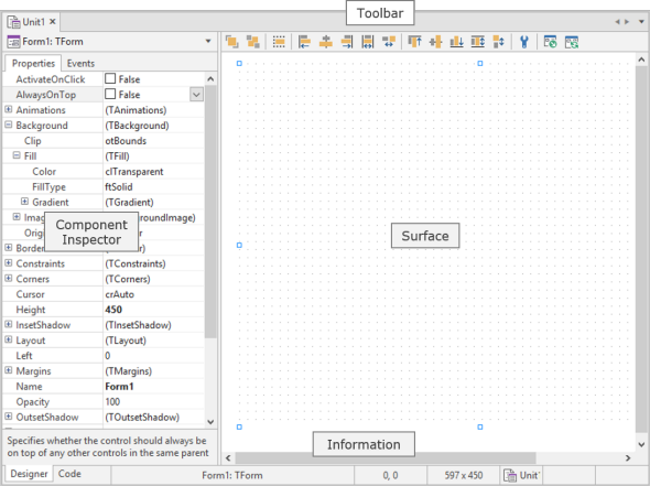
The unit of measure used by the designer surface is the pixel, and the resolution is always assumed to be 96 pixels per inch. All modern web browsers use a virtual resolution of 96 pixels per inch, regardless of the actual resolution on the client machine's display. The web browser automatically handles the translation between the virtual resolution and the display resolution of the client machine.
By default, the designer surface shows a grid to aid with component placement and alignment, and the grid guides (dots) are spaced apart at 10 pixel intervals. Please see the Modifying IDE Settings topic for more information on modifying the designer grid properties.
Any time you hover the mouse over any component on the designer surface, the name, position, and size of the component will be displayed in the information panels at the bottom of the designer.
Adding a Control or Component to a Form
When a designer is active in the IDE, the component library is accessible via the Tools window in the IDE:
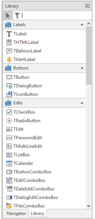
The component library is used to add both visual controls and non-visual components to the active designer. Non-visual components are represented visually at design-time, but are not visible at runtime.
Request handlers and databases are inherently non-visual and only allow non-visual components such as the TServerRequest and TDataSet components to be dropped on to the designer surface.
To filter the components in the component library, simply type in the filter text in the edit control above the component library. This is useful when there are many installed components and you're not sure of the category where the component was installed.
To see more information about a particular component in the component library, hover the mouse over the component icon. The IDE will display the name of the component and the unit in which it resides in a tooltip window.
To add a control or non-visual component to the active designer, click on the desired control or component in the component library and drag it on to the active designer surface. For controls, you can also click on the control in the component library and then draw the control on to the active designer surface using the mouse. This is useful when you want to resize the control to a particular size when it is first added to the designer surface.
When adding non-visual components to a form, the non-visual components are always added directly to the form and are never contained within another control. If you drop a non-visual component on a container control, it will be added directly to the form.
Selecting a Control or Component
When a designer is active in the IDE, the component navigator is accessible via the Tools window in the IDE:
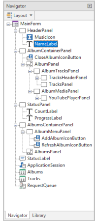
To select a single control or component via the component navigator or the designer surface, click on the desired control or component with the left mouse button. To select more than one control or component, hold down the Ctrl key while clicking on the desired controls and components with the left mouse button. Selecting multiple controls and components is desirable when one wants to resize or align multiple controls at the same time to ensure that their placement or size is uniform, or when one wants to copy and paste a group of controls or components. Multiple control and component selection is also useful for setting a property to the same value for multiple controls or components using the component inspector.
You can only select multiple controls or components within the same parent control. For non-visual components, this parent control would be the form, database, or request handler designer instance.
You can also use the mouse to directly select a group of controls or components on the designer surface using a lasso:
Once a control or component has been placed on the designer surface, you will see that the control or component will have designer handles on all four sides and corners:

These designer handles can be used to change the origin of a control or component, or the size of a control. To accomplish this, click on a designer handle with the left mouse button, hold the left mouse button down, and drag the designer handle in the desired direction. You can also use the keyboard to resize a component by holding down the Shift key while using the Up, Down, Right, and Left arrow keys to resize the component on a pixel-by-pixel basis.
Certain controls may have constraints on how tall or wide they can be, and non-visual components cannot be resized at all. In such cases, attempts to resize the control will result in the size not exceeding the constraints imposed by the control. Also, you cannot use the left mouse button to resize controls when multiple controls are selected. In such cases, you can only use the keyboard to do so.
Moving a Control or Component
To move a control or component, click on the control or component with the left mouse button, hold the mouse button down, and drag the control or component to the desired location on the designer surface. You can also use the keyboard to move a control or component by holding down the Ctrl key while using the up, down, right, and left arrow keys to move the control or component on a pixel-by-pixel basis. Both of these techniques also work when multiple controls/components are selected.
Control Layout and Alignment
The layout toolbar for the designer can be used to adjust the display order (send to back/bring to front) and position of controls on the active designer:

Each layout toolbar button has tooltip help that explains the purpose of the button.
Deleting a Control or Component
To delete a control or component, select the desired control or component using the component navigator or designer surface and press the Del key. This will also work when multiple controls/components are selected.
 Undo functionality is currently not available for the designer, so any modifications or deletions of controls/components cannot be undone. Please be careful when deleting controls/components to ensure that one does not lose a lot of hard work. If you do accidentally delete a control or component, you can fix the issue by simply closing the unit without saving the modifications, and then re-opening the unit. However, this depends upon how much other work has been done to the designer/unit since the last save point, so it is wise to save your modifications on a regular basis.
Default Event Handlers
If you double-click on a control or component in the designer, a new event handler will be created for the default event property for the control or component. For most visual or bindable controls, the default event property is the OnClick or OnChange event. Please see the Events topic in the Language Reference for more information on default events.
Toggling Between the Code Editor and Designer
In order to toggle between the code editor and the designer, press the F12 key or click on the Code or Designer tabs in the lower left-hand corner of the work area in the IDE.
Context-Sensitive Help
You can get context-sensitive help on any control or component in the designer by selecting the desired control or component and pressing the F1 key. For more information on using the help browser, please see the Accessing Help topic.
Request handlers and databases are inherently non-visual and their visual size is exclusively a design-time property that is not used at runtime.The designer surface has the following layout:
The unit of measure used by the designer surface is the pixel, and the resolution is always assumed to be 96 pixels per inch. All modern web browsers use a virtual resolution of 96 pixels per inch, regardless of the actual resolution on the client machine's display. The web browser automatically handles the translation between the virtual resolution and the display resolution of the client machine.
By default, the designer surface shows a grid to aid with component placement and alignment, and the grid guides (dots) are spaced apart at 10 pixel intervals. Please see the Modifying IDE Settings topic for more information on modifying the designer grid properties.
Any time you hover the mouse over any component on the designer surface, the name, position, and size of the component will be displayed in the information panels at the bottom of the designer.Adding a Control or Component to a Form
When a designer is active in the IDE, the component library is accessible via the Tools window in the IDE:
The component library is used to add both visual controls and non-visual components to the active designer. Non-visual components are represented visually at design-time, but are not visible at runtime.
Request handlers and databases are inherently non-visual and only allow non-visual components such as the TServerRequest and TDataSet components to be dropped on to the designer surface.To filter the components in the component library, simply type in the filter text in the edit control above the component library. This is useful when there are many installed components and you're not sure of the category where the component was installed.
To see more information about a particular component in the component library, hover the mouse over the component icon. The IDE will display the name of the component and the unit in which it resides in a tooltip window.
To add a control or non-visual component to the active designer, click on the desired control or component in the component library and drag it on to the active designer surface. For controls, you can also click on the control in the component library and then draw the control on to the active designer surface using the mouse. This is useful when you want to resize the control to a particular size when it is first added to the designer surface.
When adding non-visual components to a form, the non-visual components are always added directly to the form and are never contained within another control. If you drop a non-visual component on a container control, it will be added directly to the form.Selecting a Control or Component
When a designer is active in the IDE, the component navigator is accessible via the Tools window in the IDE:
To select a single control or component via the component navigator or the designer surface, click on the desired control or component with the left mouse button. To select more than one control or component, hold down the Ctrl key while clicking on the desired controls and components with the left mouse button. Selecting multiple controls and components is desirable when one wants to resize or align multiple controls at the same time to ensure that their placement or size is uniform, or when one wants to copy and paste a group of controls or components. Multiple control and component selection is also useful for setting a property to the same value for multiple controls or components using the component inspector.
You can only select multiple controls or components within the same parent control. For non-visual components, this parent control would be the form, database, or request handler designer instance.You can also use the mouse to directly select a group of controls or components on the designer surface using a lasso:
- If the controls or components are placed directly on a form, database, or request handler, you can click and hold down the left mouse button to begin the selection. Then, while keeping the left mouse button down, move the mouse to lasso the desired control(s) or component(s).
- If the controls are in a container control such as a panel, you can click and hold down the left mouse button, while also pressing the Ctrl key, to begin the selection. Then, while keeping the left mouse button and Ctrl key down, move the mouse to lasso the desired control(s).
Once a control or component has been placed on the designer surface, you will see that the control or component will have designer handles on all four sides and corners:
These designer handles can be used to change the origin of a control or component, or the size of a control. To accomplish this, click on a designer handle with the left mouse button, hold the left mouse button down, and drag the designer handle in the desired direction. You can also use the keyboard to resize a component by holding down the Shift key while using the Up, Down, Right, and Left arrow keys to resize the component on a pixel-by-pixel basis.
Certain controls may have constraints on how tall or wide they can be, and non-visual components cannot be resized at all. In such cases, attempts to resize the control will result in the size not exceeding the constraints imposed by the control. Also, you cannot use the left mouse button to resize controls when multiple controls are selected. In such cases, you can only use the keyboard to do so.Moving a Control or Component
To move a control or component, click on the control or component with the left mouse button, hold the mouse button down, and drag the control or component to the desired location on the designer surface. You can also use the keyboard to move a control or component by holding down the Ctrl key while using the up, down, right, and left arrow keys to move the control or component on a pixel-by-pixel basis. Both of these techniques also work when multiple controls/components are selected.
Control Layout and Alignment
The layout toolbar for the designer can be used to adjust the display order (send to back/bring to front) and position of controls on the active designer:
Each layout toolbar button has tooltip help that explains the purpose of the button.
Deleting a Control or Component
To delete a control or component, select the desired control or component using the component navigator or designer surface and press the Del key. This will also work when multiple controls/components are selected.
Undo functionality is currently not available for the designer, so any modifications or deletions of controls/components cannot be undone. Please be careful when deleting controls/components to ensure that one does not lose a lot of hard work. If you do accidentally delete a control or component, you can fix the issue by simply closing the unit without saving the modifications, and then re-opening the unit. However, this depends upon how much other work has been done to the designer/unit since the last save point, so it is wise to save your modifications on a regular basis.Default Event Handlers
If you double-click on a control or component in the designer, a new event handler will be created for the default event property for the control or component. For most visual or bindable controls, the default event property is the OnClick or OnChange event. Please see the Events topic in the Language Reference for more information on default events.
Toggling Between the Code Editor and Designer
In order to toggle between the code editor and the designer, press the F12 key or click on the Code or Designer tabs in the lower left-hand corner of the work area in the IDE.
Context-Sensitive Help
You can get context-sensitive help on any control or component in the designer by selecting the desired control or component and pressing the F1 key. For more information on using the help browser, please see the Accessing Help topic.
 More Support Options
This web page was last updated on Tuesday, September 16, 2025 at 04:56 PM | Privacy PolicySite Map © 2026 Elevate Software, Inc. All Rights Reserved Questions or comments ?  E-mail us at info@elevatesoft.com E-mail us at info@elevatesoft.com |
